Monday, April 2, 2012

AHA! Life on the Screen: George Lucas on Education

George Lucas
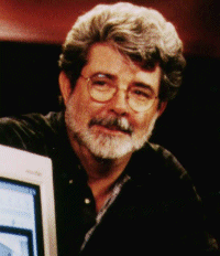
For those of us who are loyal Star Wars fans, George Lucas may be seen as near and dear to our hearts. Even if you aren't into Star Wars, Indiana Jones or American Graffiti, George Lucas is still a notable filmmaker within the realm of cinema. In the Edutopia article "Life on the Screen; Visual Literacy in Education," written by James Daly, Lucas comments on his thoughts about America's changing literacy skills. As a man who is considered to have a creative mind and who values the changing mediums with which we communicate today (film, television, web), Lucas offers his take on what the American education system needs to do to connect better with students, and encourage more visual literacy and communication skills, skills that are more applicable to our current world and students' lives.

George Lucas explains that he was "an average student who daydreamed  a lot," a description that might describe many of the students in our education system today. Perhaps it wasn't that Lucas was uninterested in the things he was being taught, rather, he was uninterested in the way in which such things were taught. This memory of his past has inspired Lucas to promote a new way of learning that emphasizes students' need to succeed in a visual, digital world. Today's students are used to a faster-paced society, and so they are more interested in learning things when they are made more relevant to the things they know. "They need to understand a new language of expression," says Lucas, which means that students want to  be taught in such a way that they are using today's tools, rather than antiquated styles of learning.

Wordle of Media
Mr. Lucas thinks there is a lot of change on the horizon. Today, the language of visual literacy has become more prominent and necessary, because or society has created a visual culture that needs to be learned about in order to be perpetuated and utilized effectively. We have so much contained within the visual culture that to not teach about and expose students to an understanding of visual literacy would be extremely unwise. Lucas remarks "We must teach communication comprehensively, in all its forms. Today we work with the written or spoken word as the primary form of communication. But we also need to understand the importance of graphics, music, and cinema, which are just as powerful and in some ways more deeply intertwined with young people's culture. We live and work in a visually sophisticated world, so we must be sophisticated in using all the forms of communication, not just the written word." I think Lucas really hits the nail on the head (to use a silly cliche) when he comments upon how we need to teach communication in relation to visual literacy. You see so many people who want to make effective presentations and get their points across effectively, in school and business settings, and often times they are very clueless in terms of what an effective presentation (using visual elements) must contain.

In terms of the future, I think that we need to take Lucas's words to heart, and really reconsider how we're approaching the development of our visual literacy, both inside the classroom and out. Do we learn more about visual literacy from our daily lives? For now I think we do, but that may be subject to change in the coming years. If Lucas's hopes are fulfilled, we're going to have to start trying harder. "Nothing is accomplished through conquest. Everything is accomplished through education," (George Lucas, 2004).

Sunday, April 1, 2012

AHA! No Reservations Mr. Bourdain...

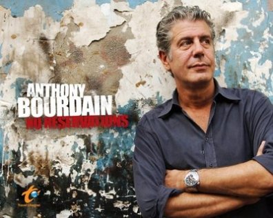
Tonight I was watching the Travel channel (as I often do), and after a while, No Reservations with Anthony Bourdain came on. I love this show and I've seen it a lot, not only because I love food and travel, but because Tony Bourdain (the fox that he is) always takes us viewers to the most unexpected, yet interesting places. I never thought of it before tonight, but No Reservations is a show that is about more than just awesome food and a handsome host, it's about going to these different places and learning about them. The people, the place, the culture that has been created and maintained in these places, these are the things that Tony Bourdain shows viewers on the show.
He is just too foxy.


Sometimes the image that we hold in our heads about places like Rajasthan, India; Mozambique, Africa; the Malaysian jungle, or  other areas we might assume to be "third world" and/or unfortunate, or even just vastly different is not as true as we might think it is. Every episode of No Reservations has Tony visiting a different place, and every place he visits I find myself changing my initial idea and perception. He really tries to focus on the people and the way that they do things, the way that they cook. What I like about No Reservations is that Tony emphasizes how beautiful it is to think about things from another perspective. He has said: "anytime you walk in another person's shoes, the world is a better place," and I think that this old adage is one of the most valuable things we can remember about humanity itself.


Now, instead of just looking at the different places on the Travel channel and thinking "I wish I could help those people improve their situations" or that my culture and my experience in life is "better" or more "ideal," I try to see more deeply. I look at the different cultures and customs the people have and I marvel at how diverse humanity is. It may sound silly, but I have learned to put myself alongside Tony and to look for the unique, the unexpected and the things that define a people.

Saturday, March 31, 2012

Wag the Dog Movie Review

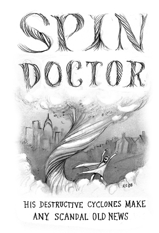
Wag the Dog was a hilariously clever movie about the guise of politics and the measures that some people will go to "spin" a story to protect their public image. Of course, the area of politics  (and in this case, the presidential election) is one that constantly under public scrutiny, especially in the United States where candidates must use their public image to secure votes from the American people. And candidates have to be very careful to depict themselves favorably, because if you do/say something, or act in such a way that the majority disagrees or finds what you do offensive or disappointing, you'll be on your way out! In the film, we see spin-doctor Conrad Bream (Robert DeNiro) and his team (including Anne Heche, Denis Leary, William H. Macy and Dustin Hoffman) concoct a plan to distract the public's attention from their candidate's alleged nefarious sex scandal by hiring a movie producer (Hoffman) to create a fake war with Albania. With all of the smoke and mirrors at their disposal, an effective distraction to the scandal is created, but then things get misconstrued and the movie ends up in a confusing mess of what is real, and what appears to be real.


This film surprised me, partially because I couldn't predict what it would be about based upon the title. Later, after watching the film and thinking about  how the plot could tie into the title, I remembered the caption at the beginning of the film:


Why does the dog wag its tail?
Because the dog is smarter than the tail.
If the tail were smarter, it would wag the dog.


Now, according to a little research that I conducted on that phrase, it means "a minor or secondary part of something controlling the whole." (Wikipedia). After reading about this, I began to understand the message that I think the director wanted to convey. In Wag the Dog, the minor or secondary part is Conrad Bream's team, who take control of the whole (the American voting public) in order to sidestep a scandal that could ruin the presidential candidate's shot for office. I think the director wanted to show how easily the media can mislead the public, especially because we rely upon and tend to naively trust the media for information. The fake war with Albania was created to distract from another (real) disaster to the candidate's campaign, and people seemed to believe it. At least for a while. The whole film just made me think about how easily I might be convinced to believe something untrue about anything, in this case a presidential candidate. What we perceive to be true may be a complete lie, and the film's director shows us with Wag the Dog just how easily that can happen.


I think this movie means to depict the people of Albania as down trodden and helpless, which they of course had to do to make people think that an actual war was going on there. I suppose one could assume that the few minorities in the film mean that they were irrelevant to the plot. I did not observe any instances where minorities were degraded or deliberately eliminated. The film director, Barry Levinson, however, is Jewish. Dustin Hoffman is from a Jewish family, but he was not brought up in any particular religious orientation, so I suppose he is "ethnically" Jewish, but not religiously. I am not sure if this had anything to do with the role he portrayed; I am just looking for ways to tie in the director's background with movie features. It may also be noted that Levinson has worked with Hoffman in other movies,  such as Rainman (1988) and in Tootsie (1982) however, he was un-credited.


People who are from different backgrounds probably wouldn't have to much of a problem with film, in terms of misinterpretation. Albanians may be offended by the choice to use their country in the ruse of a fake war, which may cause others to view them as helpless and unable to protect themselves.


The movie added to my visual literacy by introducing me to the reality that much of what we see in the media is fabricated and untrue. Now, I know that everything I see on TV is not real or true, but I didn't think about the campaigns I see government officials and hopeful elects as being complete lies. Wag the Dog showed me how it is so easy to spin things in one's favor, and to unfairly cover a mistake up with a bigger story to de-emphasize it. I don't follow politics as closely as some others, but I like to think that I educate myself pretty well when elections are at hand. The plot included details of what kind of artistic means that people might use to generate and carry out their fictitious creation. The movie producer had all kinds of tricks up his sleeve, he was a very powerful character in the movie. Initially I thought Dustin Hoffman's character wouldn't be too important., but as a movie producer, he had the resources needed to create an entire smoke screen using clever distractions and effects to really draw attention away from the presidential candidate's sex scandal. In the end, when Hoffman orders Bream killed and makes it look like he had a heart-attack, that shows how events can be twisted to seem to be what they are not. The movie made me feel like I have to be extra wary with my judgements, to not just think the first thing that pops into my head when I see something about a candidate on television, created by their campaign. They could be "wagging the dog" ;)

Thursday, March 22, 2012

Introductory Preso Experience

For my introduction in CCA, I decided to make a video to show the class who I am, and what I'm all about. I wanted to share with everyone what I find most important, what I like to do, and why I wanted to be a teacher. If they are able to understand who I am and what makes me "tick," we might be able to establish common ground between one another. I learned a lot from my classmates' presentations, and saw many different and creative ways of presenting ourselves. In CCA, we have to work in groups often, and making sure that we understand each other and get to know each other will help promote a good environment for collaboration.


Creating my video didn't take too long, I planned what I was going to say by typing up a script. It wasn't much, just things like where I was born, where I grew up, info about my family, my hobbies, and what I wanted to do as a teacher. I recorded myself speaking, kind of like a "talking heads" idea from The Office. I also recorded other frames of me doing different things, like riding a book cart at my job, the library, running up stairs (for my intro), my sister, and singing. I think I did a good job conveying who I am to my classmates. Some things have changed a little since my video, but overall I am living my life the same way!

For more Youtube videos of and by me, visit my channel!

Saturday, March 17, 2012

Thank You For Smoking Movie Review

I watched "Thank You For Smoking" the other night, and though I had seen the film before, I was surprised by what I discovered when I watched it again with the knowledge I have gained from Visual Literacy. Besides my love for William H. Macy (he just seems so benevolent! Although not necessarily in this role), I wanted to look at the plot and elements of this movie to see what I could connect with our perception today.


I think the director (Jason Reitman) of this movie wanted to point out how different points of view can really make a topic dynamic and complicated. The character Nick Naylor is a lobbyist for big tobacco, and vice-president for the "Academy of Tobacco Studies." Throughout the film, Nick is constantly defending Big Tobacco and going head-to-head with those opposed, arguing that people have the right to choose whether or not they want to smoke, that it is not the fault of Big Tobacco that smoking is killing, it is the smokers' own problems. Now, for Nick Naylor, being a tobacco lobbyist is "just a way to pay the mortgage." I think this is interested because if you look at a job like Nick's from this perspective, it really is just a job. However, Nick's perception of his job is different than those of people who have lost loved ones to the ill effects of smoking. It seemed like the director wanted to emphasize how everyone has their own personal take on things, and how easy it is for us to put a "spin" on things to justify our actions and our perspectives. For Nick Naylor, he is doing what he's good at (talking) and supporting his son.


I do not recall very many instances where minority groups are featured. It seemed to me that the characters were primarily white. There is one state official present during the end scene that is African American, and he makes the point that Americans need symbols to look at in order to understand a concept or idea. Other than this individual, I did not see many other minority representations.


The director is Jason Reitman, a Caucasian man who is Canadian. I think his background may have played a role in directing the film, because he seemed to have an interest in the story after reading the book of the same title. Therefore, he had to follow the story line of the book pretty closely, with his own interpretation of some of the action. The elements of the book are there, with Reitman's own "spin" on the characters. I think that Reitman did not necessarily eliminate focus on other ethnicity for person reasons; rather, Reitman was just trying to follow Thank You For Smoking author Christopher Buckley's initial descriptions.


Because of the limited instances of minorities in this film, I think people in these groups may be offended simply by the lack of the groups being in the film. I also think that smokers may misinterpret this movie because of the negativity against those who choose to smoke out of their own will. Throughout the film, the emphasis is on the people's choice to smoke (at least that is what Nick Naylor is always saying), and I think that maybe people who choose to smoke would feel offended that smoking is made out to seem so hated and bad. They may feel even more alienated because of their person choices than they may feel in real life, when attention is not necessarily paid to individual smokers.


There are several notable instances where visual means are used to enhance the film and focus our attention. The introductory credits sequence was done with fonts and graphics meant to imitate those on cigarette packaging. I thought this was a very clever way to show how we can be influenced by visual graphics, especially when people are trying to sell things to us. Also, there is an emphasis on how companies, in this case cigarette companies, use catchy commercials and other means to grab our attention. As the senator of Vermont, William H. Macy's character comments 
"they like to use cartoons and symbols to hook our kids," which is sometimes a very true case. Think of the Marlboro man, the great cowboy figure that was bound to interest children in the 60s and 70s. In movies, actors needed something to do while they were talking, and smoking just seemed like a "natural" thing for them to do. 
Advertisement was born inadvertently through movies! Now today, smoking characters have negative connotations, and they probably should have. These different artistic elements employed by the director made the film even more effective in showing us how advertisements can be easily justified, and how important it is to resist falling into the "spin" and to judge things for ourselves, instead of letting others make decisions for us!


Sunday, March 4, 2012

AHA-Propeller Island City Lodge

While watching Travel Channel tonight in my house with my friend Colin, there was a show about the most bizarre hotels around the world. Among the tropical resorts and rustic cabins, there was Propeller Island City Lodge in Berlin. Propeller Island describes itself as:

"Aesthetic sensation for the eye and the ear, Propeller Island is a pseudonym used by the German artist Lars Stroschen to publish his audio-visual creations. Unlimited diversity, repeating nothing and copying nothing are the guiding principles here. The most popular result: the CITY LODGE, a habitable work of art in the heart of Berlin, whose wealth of ideas never fails to attract everyone into its gravitational field and to continue inspiring guests long afterwards. A magnet for creative individuals, those weary of consumption, those who see things differently, philosophers and seekers of perspective and vision. Frequented by personalities from around the globe, this vision machine is a much-desired shooting site for photo sessions and video clips. Is that perhaps the reason these rooms seem so familiar to you?" (Propeller Island website) 

I mean, just take a look at these rooms! All photos from Propeller Island's My Berlin photos.

The "Hollywood" 

The Blue Room

How relaxing, the Tempura room

Caution, this room is wrapped!

Mirrors in every direction

Kids being too loud? They can sleep in a cage!

This room is upside down! A bed and four chairs come out of compartments in the floor!
Colin is going to Berlin in May, and he'll be in Berlin. I told him that he HAS to try and go to this hotel, just to see what other amazing rooms the City Lodge contains. I am so jealous that he gets to go in the first place, but I'm even more envious because I want to see this hospitable house of art for myself! 


AHA!-Sand Animation at Ukraine's Got Talent

I was looking through my Facebook home page today, and one of my friends had posted this video on her wall.


Artist Kseniya Simonova uses a giant light box, fine sand, emotional music and amazing sand manipulation skills to turn simple sand into beautiful art. I thought that this needed to be shared because it just goes to show how the simplest things give way to beauty if the right touch is applied, and the right eye perceives. If you watch the various images Kseniya creates out of the sand, you'll see her interpretation of Germany's invasion and occupation of the Ukraine during WWII. The Ukraine's Got Talent judges are moved to tears, and the audience members are speechless watching Kseniya work. I never thought that something so basic, like sand, could evoke such strong emotions and inspire me like this did.


Kseniya's sand art brought perceptual aesthetics to mind as she exemplified how a simple artistic medium could be used to make amazing images. Now, you might not think that what she's doing is that impressive or interesting. In fact, you might think the images in the sand art rudimentary and unsophisticated, not worthy of being called art at all. But I think they're art, because my eyes and brain tell me that I like what I see in this sand. That's what is so mysterious, yet unique and special about perception and aesthetics; what you might find ugly, I might find beautiful. "One man's trash is another man's treasure." Isn't that what they always say? It's all about how you look at it, beauty is in the eye of the beholder!

Monday, February 27, 2012

AHA-The Oscars!

Photo-Flickr: Loren Javier
This might be a stretch for a Visual Literacy blog topic, but really think that the Oscars are a big part of our country's visual culture. Though the Internet has certainly changed the face of mass communication in today's society, television and film still play significant roles in people's lives. One of the most celebrated awards in film is the Oscar, and every year the Academy Awards are televised so that America can see who and what wins each award. I would have to think that these awards and the films that essentially compete to receive them are part of our visual literacy. Since the Academy Awards are advertised and broadcast on a prime-time network during prime viewing hours (last night it was 7e/4p), one would assume that the general public finds them to be important. 37.6 million people tuned in to watch the Oscars, and it would have been 37.6 million plus one more if I hadn't had to work last night.

I think that the best film, in terms of visual literacy, this year has to have been The Artist, directed by Michael Hazanavicius. The Artist is a silent film, about a silent film star, George Valentin, who is anxious as to whether or not talking films will put him out of a job. The movie is in black and white, which keeps the focus on the action taking place on the screen. The lack of verbal communication places more emphasis on the visual elements of the film.


If you watch the trailer above, you will notice that the actors are primarily communicating with such dynamic personal visuals as facial expressions, dramatic gestures, and body language, relying completely on nonverbal communication to carry the action. The only verbal communication that occurs comes at the very end of the film. I highly recommend seeing The Artist if you haven't, it's a real treat!

Mary McNamara, a Los Angeles Times Television critic, noted that as the Oscars reoccur every year, numbers are waning. And though the Oscars have become predictable to an extent (the same process happens every year, hosts dramatically opening envelopes, famous people winning awards, giving short speeches, hosts cracking jokes in the mean time), we still love it. Maybe it's the anticipation of seeing the fashion on the red carpet, or the banter between this year's hosts, or the excitement of finding out each winning nominee. For me, it's the chance to catch a glimpse of movies I've missed for the year, to appreciate which actors and actresses have been hard at work to bring imaginative new films to life, and my favorite, seeing which film wins best cinematography! This year, it was Hugo, directed by Martin Scorsese, cinematography Robert Richardson.
Cinemastyles.blogspot.com

I love the Oscars. I try to watch them every year, because I really do think that they encompass the spirit of film. Of course, I might be biased. I am a pretty huge film devotee, and I am a loyal viewer of Turner Classic Movie's 31 days of Oscar.

See all of the nominees and winners of the Oscars 2012 here.

Sunday, February 26, 2012

SIGNS: Sometimes Speech Is Unnecessary

I was looking through our Visual Literacy schedule today, wondering (like any responsible student) what was coming due, when I noticed a link on last week's activities called "Signs." At first, I thought it was something related to the presentation that my friend and fellow classmate Lauren and I had given on February 20 for Visual Verbal Relationships. But, it wasn't. It was a Youtube video that Magda had evidently placed in the schedule to support the topics of that week. So, from the video's title, I assumed that it would be all about pictorial signs, using picture symbols to show meaning and establish communication between different parties. However, I was surprised to find that my assumption was quite wrong. Directed by Patrick Hughes, "Signs" was a sweet, unexpected short film. The focus was not on pictorial signs in place of words, but actual signs with words written on them, read by the main character Jason, and the woman he meets named Stacey. Like one of the comments on the Youtube video said, they told a more beautiful love story than Twilight did in 90 minutes!


I think that we often over-simplify communication, and we under-think about it. To an average American, at least those that I've encountered, we take words for granted. We don't realize what an affect/effect they can have on those around us, or individuals in particular. In the video, Jason is going about his hum-drum day without anything to interest or motivate him. That is, until Stacey throws herself into his life with her simple sign "Take a photo." To Jason, this sentenced might have seemed sardonic and abrasive, something that we would expect from a person who might want to be left alone. Yet, when Jason's face indicated that he was flustered and troubled by her first comment (as a result of not hearing vocal tone or inflection), Stacey followed with another sign, "I'm kidding!" Then Jason was able to understand that Stacey was interested in a conversation, which was confirmed by Stacey showing a written sign of her name. After the conversation was initiated, it continued with both Jason and Stacey communicating with one another only by written signs through windows across buildings. Though the words that these two exchanged were on a very simple level, they contained a lot of meaning because of the intentions of the parties involved.

Think about how many times we text without even thinking about how what we say could possibly be misconstrued! Now think about how even though words are valuable tools, how simply we can communicate when we need to. My friend Colin and I were watching the German film "M" from director Fritz Lang earlier today, and Colin commented that he could usually understand children's German more easily than adults. I said that it was probably because of the simplified language and increased non-verbals that children utilized, because to an extent they're still learning and getting a hang of the language. Sometimes speech is not even necessary; when you want to deeply communicate something, and you can't think of words, signs (like faces, gestures, motions and body language) save the day.

Can you think of any instances where non-verbalized communication actually serves a more useful purpose than verbal communication? Have you ever been in a situation where you couldn't think of the right words to say, until someone else said something first? Do you think that Stacey and Jason actually grew closer because they had to "meet" in this fashion?


Monday, February 13, 2012

AHA! Distortion in the Media, for Women AND Men

Of course I watched Killing Us Softly 3 for our Visual Literacy assignment last week, and I remembered some scenes that Magda had shown us when I took Ed Tech and Design in 2010. My reactions to the video centered around shock and disbelief that there were indeed so many examples of female objectification still in the media today. Maybe I was naive to think that in the 21st century, we would be moving beyond such degradation, but I guess I was wrong. Jean Kilbourn's video contained examples leading up to the new millennium, but I did a little searching and found even more examples of the objectification of women AND men from today's media. Here are some of the most unbelievable and shocking ads:
Ad for XXL Durex brand condoms. Those are band-aids. This is sick.

The "Super Seven Incher"? This ended up BANNED in the US 

This ad was actually banned in South Africa! Wonder why?

The Vampire Diaries is a book target at teens! WHAAA?
And men are being objectified too, and often are even more overlooked than the ads objectifying women. Usually those ads placing men in an objectified position have to do with women being the dominating force in the ad. For example, this:
These boys are whipped...
Clearly, this billboard (advertising "winter hosiery") is telling us that men are dogs, and women are their owners. 

I think the issues that Jean addressed in her video are applicable to both women and men. It is up to us as individuals being targeted by these advertisements to be responsible when assessing their messages. 


Monday, February 6, 2012

AHA! What You Pin Is What You See: Pinterest and Visual Literacy

OMG! Repin!
Everyone's in a fuss today about Pinterest, the new "vision board-styled socio sharing website and app where users can create and manage theme-based collections" (Wikipedia.com). The site's mission statement is  to "connect everyone in the world through the 'things' they find interesting," (Pinterest.com). If you have ever used Pinterest, it is very easy to start "pinning" things into collections based on what YOU like, or whatever you deem collection-worthy. I started Pinterest last summer, when a friend of mine invited me to join the website. I liked it initially because it was similar to Stumbleupon, in that I could just browse my interests and essentially waste time looking at things.

After a while though, I lost interest in Pinterest, mostly because I was working and in school so much that I didn't really have time to just sit and look at images of things that might have caught my attention. But examining Pinterest as a media tool that allows us to communicate and connect with each other through images alone (yes, there is text too, but the images are what catch our eye), I think it is a very interesting web application. I can go on my Pinterest homepage and see what my followers are pinning, and "repin" things that I find interesting or to my liking. All I have to do is LOOK at images and decide "yes, I like this" or "no, that doesn't really interest me" and my Pinterest boards are created. This is visually based judgment-making behavior, and something that fits very well into Visual Literacy. Can you think of any other places online where sharing your interests is as easy as sharing a photo? Looking at an image and making a judgment? Do all social networking sites have an element of visual communication?


AHA! Is Type Hype? Helvetica Movie Review


Typophile

What do the many types and fonts we encounter actually show us or tell us? Of course they communicate the words, and therefore, the objects or ideas they are representing, but do the styles of types we see really affect our perception in their own right? After viewing the film "Helvetica" from our movie list, my eyes were opened to the reality of typography. Never before had I considered what an impact different typefaces had on the way we perceive. I remember Magda's presentation from Ed Tech and Design lecture (when I took it 2 years ago), about the differences between fonts. Like how Serif and Sans Serif are different, how some are better for physical text, some better for digital presentation. 


I think the director Gary Hustwit is trying to express the importance of typeface, and how we easily overlook something that has immense importance in terms of visual literacy and affect. Helvetica as a font itself was important to typography because it made a bold statement during the Modern movement, and allowed designers the versatility of a neutral typeface to use in a variety of settings. I think the director also wanted to bring viewers' attention to the global aspect of visual design, showing how using certain design elements in typefaces brings out collective meaning and reactions across cultures.


I did not find the film particularly focused or unfocused on minority groups. I think the film's main goal was to tell the story of Helvetica as a typeface and how it inspired many designers from different areas (especially during De Stijl movement) to branch out and create new typefaces, for whatever purposes they intended. Minorities weren't necessarily excluded or included, because the main body of designers working on Helvetica were in fact Caucasian (specifically Swiss, "Helvetica" itself means "Swiss").  I also don't think that the director's background effected the way the film was made or portrayed at all, because the film was focused on how representations in typeface affected a greater population of people through advertising and its use in corporations. Some might be offended that there are few references to people of color or minorities in the film, but I think it's just because so much of the film is focused on Helvetica and Swiss typographers. I don't think they were intentionally "left out" as a whole because the director wanted it that way. 


I do see how some might claim that Helvetica's heavy use in the corporate advertising world could translate to a deeper message of "corporate oppression." The idea of corporations using certain fonts to appear neutral and more human, more relatable to people, so they don’t seem so overbearing or oppressive to consumers. But the façade aside, does the way the company is reflected actually change anything? “Now they don’t have to be accountable, accessible, or transparent, but they can look that way.” I personally thought that it just reflected about a font that did a great job getting meaning across, and one that looked good doing it.


The director used a lot of montages of images and video of the different fonts featured in the film (most notably, Helvetica). I had never realized how prominent this particular typeface was, and if I had, I didn't know what it was called. I loved seeing how one font could be manipulated in so many different ways, to serve each designer's purpose so simply, yet at the same time so complexly. As Wim Crouwel said in the film: "The meaning is in the content of the text, and not in the typeface and that is why we loved Helvetica very much." The font provides the medium within which meaning is born. The great thing about typeface is that when we want to communicate something through graphics like symbols (letters), we can choose some type of font that is neutral enough to not distract from the meaning of the content, while at the same time providing a pleasing, interesting aesthetic. 

After watching Helvetica, I felt like my visual literacy was effected because I started seeing the beauty of different fonts. I saw how certain texts did a great job getting meaning across by being at a certain level of neutrality, but how these texts also had a level of beauty and aestheticism to them, making them unique. I decided to check out The Non-Designer’s Design Book I looked at different types of type (haha, types of type!) around campus, and even though there weren’t too many to look at, I still found that there were a lot of fonts! What I noticed about the different ways in which the words were presented, was that no matter what the style of the text looked like, the main message to be displayed by the symbols was conveyed clearly. I basically became obsessed with looking at words as they were displayed publicly, looking for meaning but also looking for how they could be interpreted based on their appearances. I learned that you can look at typefaces to get the meaning they are meant to convey, but there is always a deeper element that can be seen. 


“Don’t confuse legibility with communication. Just because something’s legible doesn’t mean it communicates. And more importantly, doesn’t mean it communicates the right thing and vice versa.” -David Carson


Sunday, February 5, 2012

AHA! The Evolution of Aesthetics

http://farm4.static.flickr.com/3117/3256738189_1bc3ea9361.jpg
What makes something beautiful to you? To me? To the guy sitting next to you on the subway, or at the grocery store, or in yoga class? Aesthetics is a big branch of philosophy, focusing on the nature of beauty, art and taste, and how these things affect our appreciation of life, our emotions and sense of well-being. So what might be the most beautiful thing in the world to someone might repulse somebody else. According to Pierre Bourdou, two components affect our interpretations of beauty: "aesthetics, which is the philosophical notion of beauty; and taste, a result of an education process and awareness of elite cultural values learned through exposure to mass culture." So from a young age, our surroundings shape both our perceptions AND our aesthetic/taste preferences.

Considering the "nature vs nurture" argument in terms of human personality and psychological development, human aesthetic development can be broken down to the biological, evolutionary level. Dr. Denis Dutton, a professor of philosophy at the University of Canterbury in Christchurch, New Zealand, proposes that art appreciation (and therefore aesthetics) is less culturally learned, and stems more from evolutionary adaptations made during the Pleistocene Epoch.
http://www.ted.com/talks/denis_dutton_a_darwinian_theory_of_beauty.html

Lookin' good in the Bean
I see things and can reflect on that thing's raw beauty, the way it looks to me at face value. But when I start thinking about this object/thing more deeply, I might be able to find connections to apply to my life and the people/important things in it. For example, whenever I see "The Bean" in Chicago, I can tell you how I perceive the overall aesthetic of the structure itself- it is a large, metallic silver blob that appears to be sagging yet arched over an invisible source underneath. That's what I see. But what I SEE, with my mind's eye, and why I love the Bean so much, is my face reflected in the shining mirrored surface of the sculpture, my friends Mandy and Tyler on either side, and I can hear us laughing. It takes me back to my spring break trip to Chicago last year, and I am flooded with nostalgia. I find the Bean beautiful because of my beautiful friends. I know that we all apply beauty to things for similar reasons, too.


Thursday, February 2, 2012

Mommy, Look What I Can Do: Using Project-Based Learning in Education Today

The Thambo Project
Project-based learning is a hot topic in the world of education today. With the current generation going through school being the most "plugged in" and fast-paced to date, traditional teaching methods (ie, direct teaching, lecture, "teaching to the test") simply, for lack of a better expression, can't hack it. Educators are now looking for fresh approaches to teaching content to students, ways in which students don't just sit in their desks, silently passing class time without an inkling of interest. Cue project-based learning, or PBL. Aaaaaaannnnnnd, action!

The Buck Institute (an organization that is committed to PBL professional development and promotion), defines PBL as: "students going through an extended process of inquiry in response to a complex question, problem, or challenge. While allowing for some degree of student 'voice and choice,' rigorous projects are carefully planned, managed, and assessed to help students learn key academic content, practice 21st Century Skills (such as collaboration, communication & critical thinking), and create high-quality, authentic products and presentations." (Buck Institute Website)

Now, in education, there are 2 types of PBL (that are referred to as such): project-based learning and problem-based learning. Project-based learning focuses on a design structure that requires public presentation or performance as an outcome. So students would have to actually create something that could be exhibited to an audience (such as an art exhibit, or maybe building a structure, or creating a service in the community). Problem-based learning does not necessarily have to feature this presentation element in its overall design; however, it must still focus on inquiry for its overall purpose (Robert Ryshke, Center for Teaching). 

John Larmer and John Mergendoller (John and John, well isn't that precious?) write about the Seven Essentials for Project-Based Learning, featured in Educational Leadership's September 2010 issue, Giving Students Meaningful Work. When planning for instruction, teachers can be sure to include the following 7 elements, and  have a better chance of success in the PBL activity. 

1. Give them A Need to Know: Launch a project with an "entry event" that sparks their interest and gets them curious about the topic, and what is to come. This way, students will have an idea of the context of the project, instead of just thinking it's another "thing we'll be tested over."

2. Give them A Driving Question: Every good PBL is centered around a focused question which provides the foundation for inquiry. "A project without a question is like an essay without a thesis." Without this element, students aren't going to know what their goal in doing this project even is! What's the point!?

3. Allow for Student Voice and Choice: Remember when your teachers would just tell you what to do, without even taking into consideration that what they were assigning seemed, to teenagers, like the most BORING THING EVER? Let students be involved (to an extent, but not so that the project loses feasibility or focus) in choosing a topic for a driving question, or deciding what products they'll create, resources they'll use, and how they'll manage their time. This will make them feel less oppressed, and strike more interest! Ha, I rhymed...

4. Plan for some 21st Century Skills: Today's projects should give students a chance to practice not just their familiarity with technology, but such 21st century skills as communication, collaboration and critical thinking. Because they're going to be living and working in a world filled with potential (and the need for!) innovation.

5. Encourage Inquiry and Innovation: Work with students to generate more detailed, specific questions branching from guiding questions, so they will be able to explore different facets of a topic or issue. Raising new questions calls for synthesis of new information they have been gathering during the initial question exploration, and also leaves room for further inquiry. Students find it meaningful if they engage in real inquiry, rather than just regurgitating what the teacher has asked.

6. Give Feedback and allow for Revision: You like to get comments from others on something you've done, don't you? It is often helpful to hear what others have to say about a project you've been working on, and constructive critique is a great way for students to see how they're doing. Teachers should formalize a feedback and revision process, so students are guided and encouraged to create high-quality work.

7. Give a Publicly Presented Product: Nothing makes students feel more proud than being able to show their work, their good, hard work, to an audience. Whether it's peers, parents, or other teachers, giving students the opportunity to share what they've learned and created through a PBL endeavor solidifies the experience. "Schoolwork is more meaningful when it's done not only for the teacher or the test." 

My dad is an educator; he is the principal of Prairie Point Middle School and 9th Grade Academy in Cedar Rapids. As he has been "in the business" for nearly thirty years, he has seen how rapidly education has been able to change, how far it has come since when he first started teaching. Since he takes a general interest in the face that I too am becoming a teacher, Dad likes to send me weekly emails of educational headlines, and things to pay attention to in the world of teaching. Appropriately, just last week I got an email with some headlines/ topics all about PBL!

The ePals Global Community website gives a slough of great examples and ideas for project-based learning. Several of these include Digital Storytelling, Holidays and Festivals around the world, and many more. The great thing about this resource is that each of the PBL topics draws out essential questions to ask students during each unit.

Another great example of PBL is happening at that very same Prairie Point Middle School where my dad is principal. Students in eighth grade Family and Consumer Science (FACS) class do many different hand-on projects during the year, but a favorite is the quilt-making unit. Students work in teams to design and create custom-made flannel quilts, and then donate them to local homeless shelters and children's relief organizations. Who's the mastermind and director behind these students' nimble stitchings?


My mother, of course!

My mom and her students do a quilting unit, where the students create these quilts and donate their finished products. The students start with a plan, asking themselves "how can we collaborate to design and create the highest quality flannel quilt?" They challenge themselves to work in groups, collaborating on how it will look, who will sew what squares, what they'll do to construct the overall quilt, and how they'll deliver a presentation of their progress and end product to parents, teachers, other students and the community. They also have the satisfaction of donating these projects to Project Linus, where children who may not have even had the opportunity for the simple comfort of their own blanket. My mom tells me that her students are very receptive to this project, they work well together, and are very proud of their quilts when the project is finished. They displayed photographs and write ups in the hallways of the middle school for parent-teacher conferences, so parents could see their children's hard work and dedication. Mom also told me that the students feel accomplished and like they've done something to really help on a personal level, AND they learn valuable math and tactile sewing skills in the process!

PBL seems like a great choice for teachers to use in their classrooms to engage and interest students, and bring them to the inquiry process.


Monday, January 30, 2012

AHA! Street Art Making Bold Statements


Streetartutopia.com-Banksy
I have to admit, I’ve really gotten obsessed with street art lately. From a visual literacy standpoint, I think street art displays a wide array of communication styles, from textual to completely image based. Sometimes this art is just depicted in gorgeous, colorful, larger-than-life images projected onto sidewalks, the sides of buildings, or other city structures. Other times street art can be ordinary everyday objects manipulated and touched up to represent something new. And then there are instances where a simple word sketched in a certain font, at a specific place in full view, that can make the most striking statements. 

Streetartutopia.com

Streetartutopia.com
Streetartutopia.com


Bansky
The way we see things affects our thoughts and emotions, really anything. For a bit of “fun” reading right now, I’ve been reading Looks: Why They Matter More Than You Ever Imagined, a book about physical appearance and the way in which it affects our perception of others. To me, this really related to the perception that we experience in looking at messages, images and objects in our daily lives, because the way something looks is usually the first information we use to 
construct meaning about said subject.


Banksy


With street art, we’re given these images that have been created to make a bold statement for the public. What the statement is varies; it’s always about getting the image out there for all to see, so that the message can be interpreted by us, the perceiver. The process for this creation mirrors the process described in our Visual Literacy textbook. Artists, like Banksy for example, are the source of the message. They develop what message (thought, concept, ideology) they want to communicate, they visualize and translate this message and apply the design process of turning the thought into a graphic form. Then Banksy works with his his main medium and location, whatever these may be (he's a versatile guy) and actually creates the street art graphic. Audiences of those who pass by, who seek out this art, or are looking at it through secondary mediums (Internet) receive the messages of the graphic, and interpret it for themselves. With street art, it's all about interpretation. People put things in public places for others to SEE. And everything we perceive, everything our eyes meet, we interpret.

Monday, January 23, 2012

AHA! Visual Symbols in My Life


The Ministry of Type
We look around and see things in our lives every day. We read ads, billboards, brochures, magazines, weblinks emails hypertext textmessages letters codes signs signals everything.


The visual symbols in my life very well affect how I live and behave on a day to day basis. Especially as a college student, I interact with unending amounts of visual symbols serving the purpose of connecting me with people, places, objects and ideas. 


Target
I use visual symbols all the time, meaning I perceive and interpret the symbols to understand different messages and concepts. I work at Rod library on campus at UNI, and we use all kinds of visual symbols, often along with text, to communicate library expectations. Where no food/drink is allowed, we use icons to reiterate our point. When I go out and I see signs for Starbucks, or the Target logo, or even street signs like "Stop" or "Yield," meaning is triggered almost more from the image itself than the words that accompany it. 
Starbucks

I think in today's world, one absolutely must possess high familiarity with and skills within the realm of visual literacy. It is pertinent to understand the importance of this type of ability in people, because in a culture that is rather obsessed with visuals (ads, logos, appearances, celebrity, etc), it is a driving force behind our interactions. 


This semester in Visual Literacy, I hope to become more familiar with the concept as a whole, and also really gain an understanding of how images can function in conjunction with my own classroom material. I hope to also gain knowledge of design principals, visual literacy standards, and some of the technology that assists artists and designers in their creation. Finally, I would like to get into the more creative process that is involved in generating images, because I think learning more about visual literacy will help me become more confident to experiment with digital art. 

Think of the way we refer to things as "iconic." The root word here is "icon." Things are iconic because they have become symbols, most often visual, or representatives of a general category. When we see certain symbols, we automatically know what they stand for, because we have brought up in a culture (at least I have, born in 1990 and growing up in the 90's and 2000s) that absolutely thrives on these visuals. You could say that this McDonalds logo could represent FOOD. You know when you see this logo that there is one general thing this place offers, and when you think of it, it automatically represents itself. 


McDonalds


Take UNI's very popular and campus-wide symbol "UNIam..." As much as I am sick of this logo (no offense to its designers or promoters), it is widely recognized as representative of the University. 


Iowa Hawkeyes
Perhaps even more recognizable and unmistakable is this: 


I don't even have to tell you what this image represents. In Iowa, you know it, in the U.S. you probably know it if you're a football fan, and around the world, you'll at least be able to recognize that this is some type of bird. 


And any of these symbols you'll be able to attach some meaning to, whether it is arbitrarily assigned by society, or for its literal representation. 


Often, people won't stop to read text that is designated as a warning or information. People want to "glance and go" and not have to spend time decoding text for meaning. However, we DO use text to perform the same functions as images and icons, and we favor certain types of text over others. Letters are individual icons, the combinations of which we call words, that make up our entire written language code. I'd like to note that after watching the first film on our movie list, I'm typing this post in Helvetica. "And Helvetica says everything, and that's perhaps part of its appeal," (Jonathan Hoefler).


Thursday, January 19, 2012

CCA: Will You Live Up to My Expectations?

Classroom Computer Applications. CCA. That class you take right after Ed Tech and Design, but before all your other tech classes, if you're smart. A course designed to help us learn about using project-based learning in conjunction with technology to engage and encourage students. Right? Well, I took several other technology classes for my minor BEFORE getting to take this course, and I have to say, I'm very excited for it. I'm more excited for it because I know that I can apply the skills I have gained from my other tech courses to this one, and expand on my knowledge. From what I've seen in the 4 classes we've had so far this semester, we're all in for one heck of a journey full of creative discovery.

My main expectation for CCA is this: I expect to learn about different approaches to designing project-based learning activities that I can apply directly to my English classrooms in the future. Specifically, I want to find some unique methods of integrating real-world types of activities into and English setting, so students can connect their own experiences and prior knowledge to the new things they are learning about. I expect my classmates to come with open minds and the willingness to get creative, and collaborative! I expect my professor (that's you Dr. Z) to provide us with the scaffolding (whoa, pedagogy word! but seriously) we need to see how the tools we're introduced to in class can indeed be applied to our classrooms.

Out of all my courses this semester, I think I really am most excited for this one. And it's because of the nature of the class, the hand-on, collaborative, creative work that we'll be doing, that separates it from my other courses. Hey, isn't that what we're learning about?!?!