"It's the sense of touch. In any real city, you walk, you know? You brush past people, people bump into you. In L.A., nobody touches you. We're always behind this metal and glass. I think we miss that touch so much, that we crash into each other, just so we can feel something." With these words, Don Cheadle's character Graham Waters opens Crash. When I first heard about Crash, I didn't expect it to be about race and perception. I thought it was a movie about cars! But after watching, I realized that the issues contained in the film are more real than I ever thought them to be before.
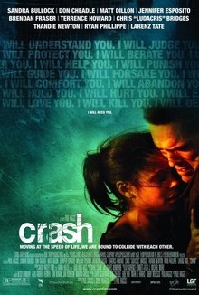
1. I think the director's message is simple: there is racism and prejudice hidden in the most unexpected of places. Unfortunately, though our world is continually becoming more global and diverse, there are individuals who are resistant to the harmony that our world hopes to achieve. Through exposing how race seems to be such a sensitive issue, and how people often aren't what they seem, I think the director really wanted to emphasize how sometimes we bring these issues to light, just so we can feel human. Just so we can understand that everyone has similar needs, wants and feelings, no matter what we look like.
2. I think that the movie has depictions of minorities that promote the message of the movie. There are very obvious instances of stereotypes that exist within the film, including Sandra Bullock's character, the white, racist woman, as well as the two African American men who are depicted as "tough" and steal a car, the Persian man who is angry, and the white gun shop owner who distrusts him. Several other depictions feel earnest, including Don Cheadle's character Graham Waters and his partner, Ria. The whole movie is organized around individuals applying stereotypes towards others. To support the director's intended message, that we are all interwoven without even realizing it, and we often "crash" into people we don't expect to, I think the minorities were situational.
3. I think the director's professional and educational background played a role in directing Crash. Since this film has kind of a subtle message, and presents it in an artistic way. Paul Haggis was very influenced by the films of Alfred Hitchcock and Jean-Luc Godard, both notorious for creating iconic, striking films. I think that Crash falls into a similar category. It is memorable, and deals with serious issues in a dynamic, yet subtle way.
4. I would hope that individuals watching this film would understand its message of inter-woven lives, and not be offended by the medium and characters used to convey it. However, I think that African Americans, people from the Middle East, and Asian people might be offended, because some of their minority groups are depicted stereotypically and thus negatively.
5. The movie added to my visual literacy by challenging my perceptive powers. Since so many of the characters' lives intersect throughout the film, (and there are a lot of characters, whose stories all have something to add to each other), I had to continually update my idea of each character, when I gained new information about them. I think we can use this type of perceptive update in our everyday lives, by reminding ourselves that no matter who a person is, we never know when their life might "crash" into our own.
6. Like Jean-Luc Godard and Alfred Hitchcock, Paul Haggis employs subtle visual means to convey the message of how people's separate lives "crash" into each other sometimes. By the recurrence of characters encountering one another, and different events causing "domino effects," this causes viewers to have to recall their initial perceptions of characters and compare them to how said characters are represented throughout the film.
Occasionally colloquial and most certainly lacking eloquence: the thoughts of a highly-strung English major. Musings on education, techhnology in the classroom, book reviews, and more.
Showing posts with label visual. Show all posts
Thursday, April 26, 2012
Crash Movie Review
Labels:
communication,
crash,
film,
movies,
multiculturalism,
perception,
race,
visual,
visualliteracy
AHA-1 in 4 Homeless are Veterans
Today, we learned about the veterans in America who are homeless. Veterans have fought hard to keep our country safe and secure, yet many of them are without homes, because they are injured and cannot work or keep jobs to pay for housing. We watched a video about a homeless veteran, and it was very sad to watch a grown man who has worked so hard, go without. The group presenters showed us different organizations connected with the United States Department of Veterans Affairs, and among these organizations, there are many places to help homeless veterans. I learned that 1 in 4 homeless persons are veterans, and this is a very sad statistic. Being those who have worked hard to protect our home, the United States of America, shouldn't ALL veterans be guaranteed a safe and comfortable home?
I decided to research the Veteran Justice Outreach Initiative, a program that helps to eliminate the unnecessary criminalization of mental illness and extended incarceration among Veterans. The program will do this by ensuring that Veterans who struggle with mental illness or substance abuse are given adequate medical attention and services before they are released. A lot of individuals who have fought in wars suffer from mental illnesses, especially Post Traumatic Stress Disorder. It makes me very sad to think that some Veterans end up homeless because they needed more recovery and rehabilitation time, and are not given it. The VJO helps ensure that these Veterans get the time and access they need to services, so they have a better chance of re-incorporating themselves into society. My poster includes the organization's name (Veteran Justice Outreach Initiative), the three things that it sets out to do (in white), as well as contact information for the two program directors. I also included the url, in case readers want to visit the VJO site.
This organization will help Veterans by extending extra medical attention and care to those who need mental health services. I think that knowing about it will also help change our perceptions about homeless Veterans. This poster is a visual that was created to spread awareness about a program that is helping homeless Veterans around the United States. I hope that others will reconsider what they think when they see these homeless individuals, because they are not just "some bums" looking for easy money. They fought for us. Now let's fight for them.
Labels:
homelessness,
perception,
programs,
unicca,
unitedstates,
veterans,
visual,
visualliteracy,
vjo
Monday, April 2, 2012
AHA! Life on the Screen: George Lucas on Education
George Lucas |
George Lucas explains that he was "an average student who daydreamed a lot," a description that might describe many of the students in our education system today. Perhaps it wasn't that Lucas was uninterested in the things he was being taught, rather, he was uninterested in the way in which such things were taught. This memory of his past has inspired Lucas to promote a new way of learning that emphasizes students' need to succeed in a visual, digital world. Today's students are used to a faster-paced society, and so they are more interested in learning things when they are made more relevant to the things they know. "They need to understand a new language of expression," says Lucas, which means that students want to be taught in such a way that they are using today's tools, rather than antiquated styles of learning.
Wordle of Media |
In terms of the future, I think that we need to take Lucas's words to heart, and really reconsider how we're approaching the development of our visual literacy, both inside the classroom and out. Do we learn more about visual literacy from our daily lives? For now I think we do, but that may be subject to change in the coming years. If Lucas's hopes are fulfilled, we're going to have to start trying harder. "Nothing is accomplished through conquest. Everything is accomplished through education," (George Lucas, 2004).
Saturday, March 31, 2012
Wag the Dog Movie Review
Wag the Dog was a hilariously clever movie about the guise of politics and the measures that some people will go to "spin" a story to protect their public image. Of course, the area of politics (and in this case, the presidential election) is one that constantly under public scrutiny, especially in the United States where candidates must use their public image to secure votes from the American people. And candidates have to be very careful to depict themselves favorably, because if you do/say something, or act in such a way that the majority disagrees or finds what you do offensive or disappointing, you'll be on your way out! In the film, we see spin-doctor Conrad Bream (Robert DeNiro) and his team (including Anne Heche, Denis Leary, William H. Macy and Dustin Hoffman) concoct a plan to distract the public's attention from their candidate's alleged nefarious sex scandal by hiring a movie producer (Hoffman) to create a fake war with Albania. With all of the smoke and mirrors at their disposal, an effective distraction to the scandal is created, but then things get misconstrued and the movie ends up in a confusing mess of what is real, and what appears to be real.
This film surprised me, partially because I couldn't predict what it would be about based upon the title. Later, after watching the film and thinking about how the plot could tie into the title, I remembered the caption at the beginning of the film:
Why does the dog wag its tail?
Because the dog is smarter than the tail.
If the tail were smarter, it would wag the dog.
Now, according to a little research that I conducted on that phrase, it means "a minor or secondary part of something controlling the whole." (Wikipedia). After reading about this, I began to understand the message that I think the director wanted to convey. In Wag the Dog, the minor or secondary part is Conrad Bream's team, who take control of the whole (the American voting public) in order to sidestep a scandal that could ruin the presidential candidate's shot for office. I think the director wanted to show how easily the media can mislead the public, especially because we rely upon and tend to naively trust the media for information. The fake war with Albania was created to distract from another (real) disaster to the candidate's campaign, and people seemed to believe it. At least for a while. The whole film just made me think about how easily I might be convinced to believe something untrue about anything, in this case a presidential candidate. What we perceive to be true may be a complete lie, and the film's director shows us with Wag the Dog just how easily that can happen.
I think this movie means to depict the people of Albania as down trodden and helpless, which they of course had to do to make people think that an actual war was going on there. I suppose one could assume that the few minorities in the film mean that they were irrelevant to the plot. I did not observe any instances where minorities were degraded or deliberately eliminated. The film director, Barry Levinson, however, is Jewish. Dustin Hoffman is from a Jewish family, but he was not brought up in any particular religious orientation, so I suppose he is "ethnically" Jewish, but not religiously. I am not sure if this had anything to do with the role he portrayed; I am just looking for ways to tie in the director's background with movie features. It may also be noted that Levinson has worked with Hoffman in other movies, such as Rainman (1988) and in Tootsie (1982) however, he was un-credited.
People who are from different backgrounds probably wouldn't have to much of a problem with film, in terms of misinterpretation. Albanians may be offended by the choice to use their country in the ruse of a fake war, which may cause others to view them as helpless and unable to protect themselves.
The movie added to my visual literacy by introducing me to the reality that much of what we see in the media is fabricated and untrue. Now, I know that everything I see on TV is not real or true, but I didn't think about the campaigns I see government officials and hopeful elects as being complete lies. Wag the Dog showed me how it is so easy to spin things in one's favor, and to unfairly cover a mistake up with a bigger story to de-emphasize it. I don't follow politics as closely as some others, but I like to think that I educate myself pretty well when elections are at hand. The plot included details of what kind of artistic means that people might use to generate and carry out their fictitious creation. The movie producer had all kinds of tricks up his sleeve, he was a very powerful character in the movie. Initially I thought Dustin Hoffman's character wouldn't be too important., but as a movie producer, he had the resources needed to create an entire smoke screen using clever distractions and effects to really draw attention away from the presidential candidate's sex scandal. In the end, when Hoffman orders Bream killed and makes it look like he had a heart-attack, that shows how events can be twisted to seem to be what they are not. The movie made me feel like I have to be extra wary with my judgements, to not just think the first thing that pops into my head when I see something about a candidate on television, created by their campaign. They could be "wagging the dog" ;)
Monday, February 6, 2012
AHA! What You Pin Is What You See: Pinterest and Visual Literacy
OMG! Repin! |
After a while though, I lost interest in Pinterest, mostly because I was working and in school so much that I didn't really have time to just sit and look at images of things that might have caught my attention. But examining Pinterest as a media tool that allows us to communicate and connect with each other through images alone (yes, there is text too, but the images are what catch our eye), I think it is a very interesting web application. I can go on my Pinterest homepage and see what my followers are pinning, and "repin" things that I find interesting or to my liking. All I have to do is LOOK at images and decide "yes, I like this" or "no, that doesn't really interest me" and my Pinterest boards are created. This is visually based judgment-making behavior, and something that fits very well into Visual Literacy. Can you think of any other places online where sharing your interests is as easy as sharing a photo? Looking at an image and making a judgment? Do all social networking sites have an element of visual communication?
Labels:
design,
images,
photos,
pinterest,
socialnetworking,
unietd,
visual,
visualliteracy,
web 2.0
AHA! Is Type Hype? Helvetica Movie Review
Typophile |
What do the many types and fonts we encounter actually show us or tell us? Of course they communicate the words, and therefore, the objects or ideas they are representing, but do the styles of types we see really affect our perception in their own right? After viewing the film "Helvetica" from our movie list, my eyes were opened to the reality of typography. Never before had I considered what an impact different typefaces had on the way we perceive. I remember Magda's presentation from Ed Tech and Design lecture (when I took it 2 years ago), about the differences between fonts. Like how Serif and Sans Serif are different, how some are better for physical text, some better for digital presentation.
I think the director Gary Hustwit is trying to express the importance of typeface, and how we easily overlook something that has immense importance in terms of visual literacy and affect. Helvetica as a font itself was important to typography because it made a bold statement during the Modern movement, and allowed designers the versatility of a neutral typeface to use in a variety of settings. I think the director also wanted to bring viewers' attention to the global aspect of visual design, showing how using certain design elements in typefaces brings out collective meaning and reactions across cultures.
I did not find the film particularly focused or unfocused on minority groups. I think the film's main goal was to tell the story of Helvetica as a typeface and how it inspired many designers from different areas (especially during De Stijl movement) to branch out and create new typefaces, for whatever purposes they intended. Minorities weren't necessarily excluded or included, because the main body of designers working on Helvetica were in fact Caucasian (specifically Swiss, "Helvetica" itself means "Swiss"). I also don't think that the director's background effected the way the film was made or portrayed at all, because the film was focused on how representations in typeface affected a greater population of people through advertising and its use in corporations. Some might be offended that there are few references to people of color or minorities in the film, but I think it's just because so much of the film is focused on Helvetica and Swiss typographers. I don't think they were intentionally "left out" as a whole because the director wanted it that way.
I do see how some might claim that Helvetica's heavy use in the corporate advertising world could translate to a deeper message of "corporate oppression." The idea of corporations using certain fonts to appear neutral and more human, more relatable to people, so they don’t seem so overbearing or oppressive to consumers. But the façade aside, does the way the company is reflected actually change anything? “Now they don’t have to be accountable, accessible, or transparent, but they can look that way.” I personally thought that it just reflected about a font that did a great job getting meaning across, and one that looked good doing it.
After watching Helvetica, I felt like my visual literacy was effected because I started seeing the beauty of different fonts. I saw how certain texts did a great job getting meaning across by being at a certain level of neutrality, but how these texts also had a level of beauty and aestheticism to them, making them unique. I decided to check out The Non-Designer’s Design Book I looked at different types of type (haha, types of type!) around campus, and even though there weren’t too many to look at, I still found that there were a lot of fonts! What I noticed about the different ways in which the words were presented, was that no matter what the style of the text looked like, the main message to be displayed by the symbols was conveyed clearly. I basically became obsessed with looking at words as they were displayed publicly, looking for meaning but also looking for how they could be interpreted based on their appearances. I learned that you can look at typefaces to get the meaning they are meant to convey, but there is always a deeper element that can be seen.
“Don’t confuse legibility with communication. Just because something’s legible doesn’t mean it communicates. And more importantly, doesn’t mean it communicates the right thing and vice versa.” -David Carson
Labels:
david carson,
design,
font,
Gary Hustwit,
gestalt,
helvetica,
typeface,
typography,
unietd,
visual,
visualliteracy,
wim crouwel
Sunday, February 5, 2012
AHA! The Evolution of Aesthetics
![]() |
http://farm4.static.flickr.com/3117/3256738189_1bc3ea9361.jpg |
Considering the "nature vs nurture" argument in terms of human personality and psychological development, human aesthetic development can be broken down to the biological, evolutionary level. Dr. Denis Dutton, a professor of philosophy at the University of Canterbury in Christchurch, New Zealand, proposes that art appreciation (and therefore aesthetics) is less culturally learned, and stems more from evolutionary adaptations made during the Pleistocene Epoch.
![]() |
Lookin' good in the Bean |
Labels:
aesthetics,
art,
beauty,
denisdutton,
digital creativity,
philosophy,
taste,
unietd,
visual,
visualliteracy
Monday, January 23, 2012
AHA! Visual Symbols in My Life
![]() |
The Ministry of Type |
The visual symbols in my life very well affect how I live and behave on a day to day basis. Especially as a college student, I interact with unending amounts of visual symbols serving the purpose of connecting me with people, places, objects and ideas.
![]() |
Target |
![]() |
Starbucks |
This semester in Visual Literacy, I hope to become more familiar with the concept as a whole, and also really gain an understanding of how images can function in conjunction with my own classroom material. I hope to also gain knowledge of design principals, visual literacy standards, and some of the technology that assists artists and designers in their creation. Finally, I would like to get into the more creative process that is involved in generating images, because I think learning more about visual literacy will help me become more confident to experiment with digital art.
Think of the way we refer to things as "iconic." The root word here is "icon." Things are iconic because they have become symbols, most often visual, or representatives of a general category. When we see certain symbols, we automatically know what they stand for, because we have brought up in a culture (at least I have, born in 1990 and growing up in the 90's and 2000s) that absolutely thrives on these visuals. You could say that this McDonalds logo could represent FOOD. You know when you see this logo that there is one general thing this place offers, and when you think of it, it automatically represents itself.
![]() |
McDonalds |
Take UNI's very popular and campus-wide symbol "UNIam..." As much as I am sick of this logo (no offense to its designers or promoters), it is widely recognized as representative of the University.
![]() |
Iowa Hawkeyes |
I don't even have to tell you what this image represents. In Iowa, you know it, in the U.S. you probably know it if you're a football fan, and around the world, you'll at least be able to recognize that this is some type of bird.
And any of these symbols you'll be able to attach some meaning to, whether it is arbitrarily assigned by society, or for its literal representation.
Often, people won't stop to read text that is designated as a warning or information. People want to "glance and go" and not have to spend time decoding text for meaning. However, we DO use text to perform the same functions as images and icons, and we favor certain types of text over others. Letters are individual icons, the combinations of which we call words, that make up our entire written language code. I'd like to note that after watching the first film on our movie list, I'm typing this post in Helvetica. "And Helvetica says everything, and that's perhaps part of its appeal," (Jonathan Hoefler).
Labels:
21stcenturyeducation,
icons,
learning,
perception,
symbols,
uni,
unicca,
unietd,
visual,
visualliteracy,
VL,
VL2012
Subscribe to:
Posts (Atom)